Iron Lizard Games
Game UI Redesign: From SaaS Dashboard to Title Screen
A game UI redesign from the engineering side: how LoreKeeper went from tabs and modals to a title screen, a book-like play view and audio, behind flags.
For two years our web RPG looked like a SaaS product: a home with tabs, a forced quick-start modal, a welcome banner, a referral banner. It worked, but it felt like logging into an admin panel to play a game. In late October 2026 we replaced it.
This post covers that game UI redesign from the engineering side: what we changed screen by screen, how we shipped a rewrite of the core play screen behind feature flags, and the two small systems (one loader, one audio engine) that made the result feel like one game. We also list the parts that cost us more than we expected.
The game and why its UI had to change
LoreKeeper is a tabletop RPG where an AI plays Dungeon Master, solo or with up to six players in real time. It runs in the browser and on mobile: a Next.js app with HeroUI components and Socket.io for multiplayer.
The old UI was built feature by feature. Each new system (worlds, heroes, quests, the shop) got a tab or a page that looked like the others: cards, tables, a sidebar. The result was consistent and generic. Players who arrived from the marketing site, which already had a dark fantasy look, landed in something that read as a dashboard.
In our design document the new direction is called "The Scriptorium at Midnight". The idea is a player sitting alone at night with a Game Master and a campaign that can last months. The interface borrows from illuminated manuscripts and fine-press fantasy novels. That means old gold on near-black, Cinzel capitals, and surfaces that look like brass, leather or parchment rather than generic CSS gradients and glows. Three rules from that document shaped most decisions:
- Dark only. The six selectable themes (fantasy, grimdark, arcane neon, steampunk, tavern, nautical horror) are all dark. A bright UI at 1 a.m. is painful.
- Gold is rare. The accent color is reserved for emphasis, so most of the screen stays neutral.
- Prose is the product. Panels and chips sit around the narrative text and should never pull attention away from it.
The redesign, screen by screen
We split the work into phases, each with its own spec, visual checklist and end-to-end tests. Most of the portal phases landed between October 27 and 30, 2026, on a long-lived branch with more than 230 commits.
| Old screen | New screen | What changed |
|---|---|---|
| Home with tabs and modals | El Umbral (the threshold) | Your main campaign as a full-screen title screen |
| Character list | Heroes | Full-body art, a forge for new heroes, each hero opens on its last campaign |
| Creation wizard | New adventure ritual | One question per step, answers stored in the URL |
| Campaign settings page | Lobby as a party table | Story first, one seat per player slot, a single main action |
| Worlds tab | Wall of portals | Arched cards with type, counts and filters |
| Global quest catalog | Quest board | New quests since your last visit pinned on top |
| Credits page | Shop | A merchant character, shelves, a sticky purchase bar |
| Play page | The Codex | A rewrite of the play screen as a book |
El Umbral: the home as a title screen
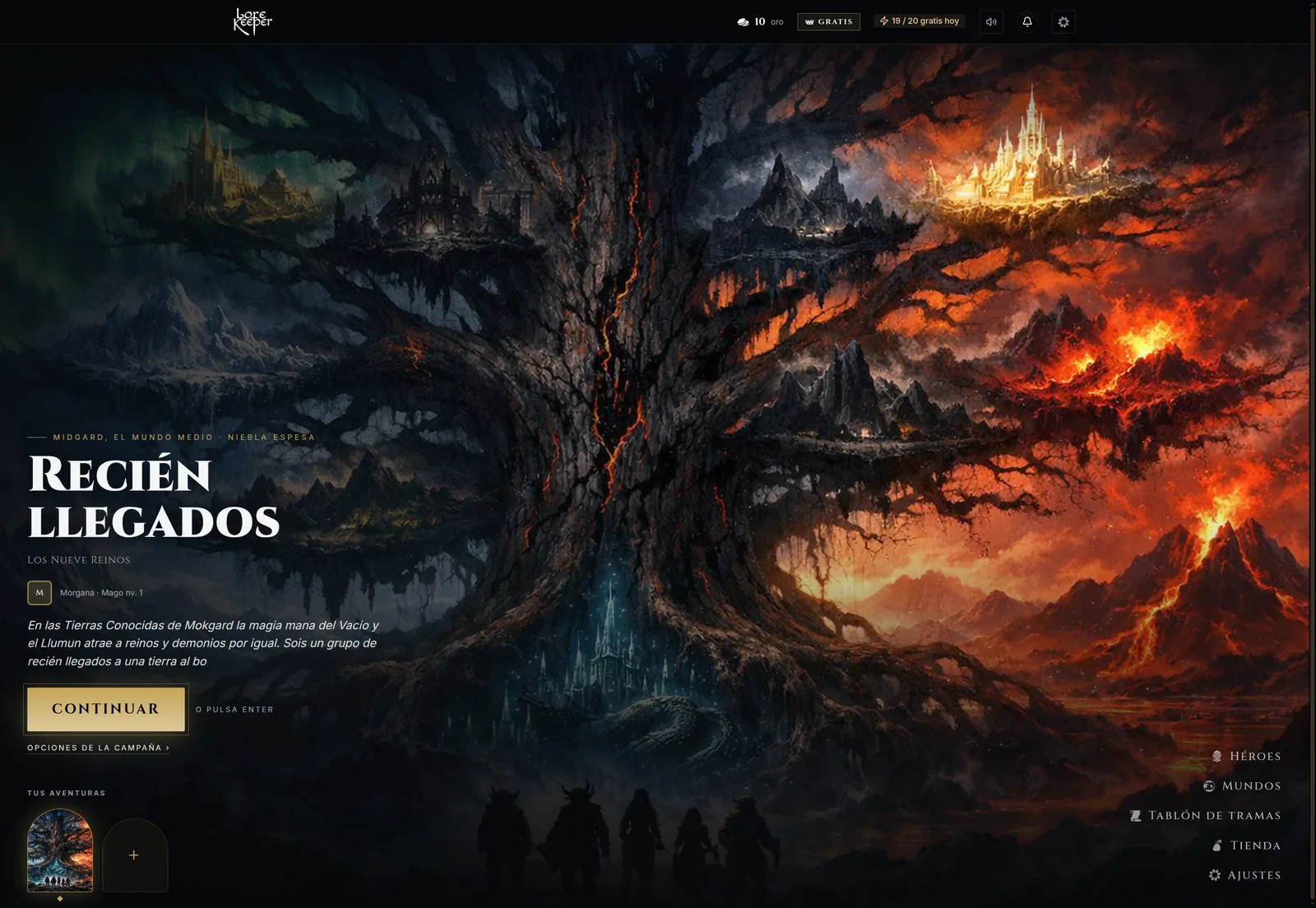
The home now renders the player's main campaign the way a console game renders its title screen: full-screen scene art with a slow zoom, fog and embers, then place, time and weather, the campaign title, your hero, the story hook and one dominant Continue button. Enter also continues, unless the user is typing in an input or a control has focus.
El Umbral. The player's campaign is the first thing on screen, and Continue is the only primary action.
Arched "doors" at the bottom switch the whole screen between your adventures. Navigation lives in a small vertical menu in the corner. The tabs, the forced quick-start modal, the welcome header and the referral banner are gone. Old ?activeTab= links redirect to the new sections, so bookmarks and emails sent before the change still work.
On the data side, the Umbral gets everything from a single request. Scene art, hook and party arrive together, so the screen doesn't assemble itself piece by piece while the backdrop is already animating.
One path to start any adventure
Before, you could start a campaign from at least three places, each with its own wizard. Now there is one flow, the "portal ritual": what calls you (a world), what you seek (free play or a written quest), who you want to be (a new or existing hero), then a reveal with the editable name and two exits, start now or invite friends.
The answers are stored in the URL. The browser Back button returns to the previous question, and if you leave the flow to create a hero in the hero forge, you come back to the step you left. Stale answers (a deleted world, a hero from another world) fall back to asking again instead of failing. The quest board and the Umbral doors open the same ritual at the right step, so there is one code path to maintain.
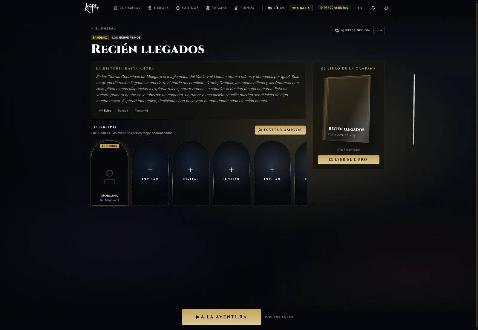 The lobby as a party table. Each seat is a real player slot, an empty seat is an invite button, and there is one action at the bottom.
Wall of portals and quest board
The worlds tab became a wall of arches. The first arch is always a "forge" portal for creating a new world. Each world arch shows its genre, name, counts of races, places and factions, and badges for official and owned worlds. Clicking an arch expands it to show details and actions. Esc collapses it, and the arrow keys move across the wall. The 3D tilt on hover only reacts to a mouse pointer and is disabled under prefers-reduced-motion.
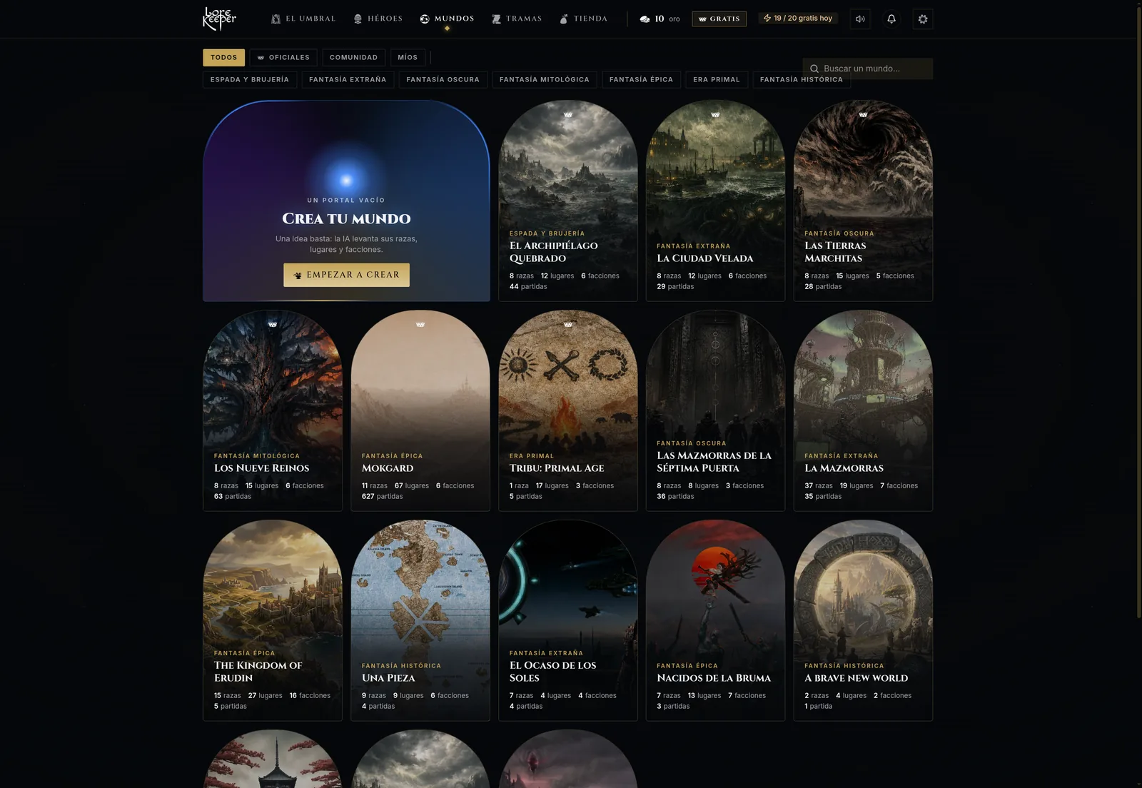 The wall of portals replaced a tabbed list. Filtering happens in the browser, on data from a single endpoint.
The Codex: rewriting the play screen
The largest piece was the play screen. The old /play page was a single component of about 4,000 lines that mixed transport, turn logic and UI. We didn't try to refactor it. We rewrote it from scratch on a separate route next to the old one and called the new screen the Codex.
Each part of the new screen has one clear owner:
- React Query owns the message history.
- A Zustand store holds the state of the current play session.
- An explicit turn state machine drives each turn through
analyze → roll → send → stream. - The message feed is a virtualized list (React Virtuoso), so a campaign with thousands of turns scrolls without loading every message into the DOM.
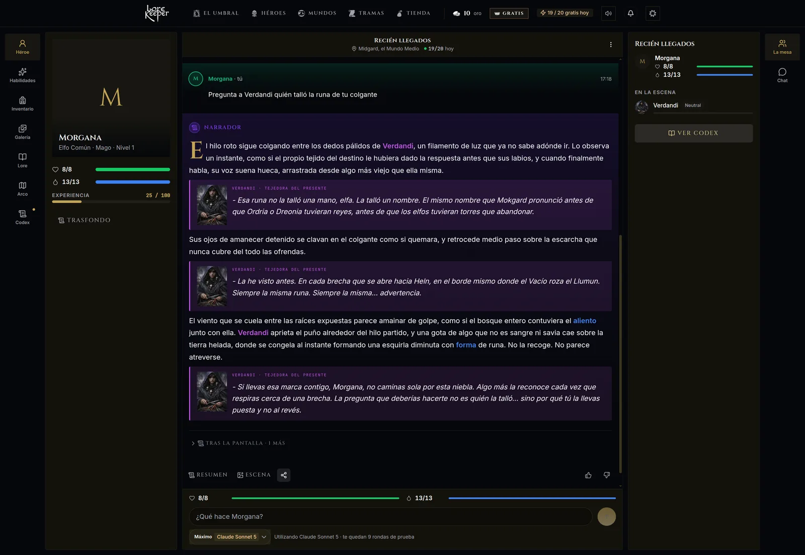 The Codex. Narration sits in the center with one drop cap per narrative block. The hero is on the left and the table on the right.
Typography follows the book idea. Narrative prose is capped at 68 characters per line with a line height of 1.78, and only the first paragraph of a narrative block gets the Cinzel drop cap. Players can tune font size, line height, dimming of read text and hiding the bars while reading. Those preferences are stored per user on the server, so they follow the player across devices. A change applies instantly and reverts with a notice if saving fails.
Returning players get a "Previously on…" story: the last rounds as slides (scene, portraits, the key roll and its consequences) followed by the stored recap. It replaced a banner nobody looked at.
Shipping a rewrite behind a feature flag
We didn't want a big-bang switch for the screen where players spend almost all their time. The rollout went in steps:
- The Codex shipped at
/campaigns/[slug]/play-nextbehind aPLAY_CODEXflag. Both/playand/play-nextredirected on the server according to the flag. - Multiplayer campaigns stayed on the old play screen until a later phase of the rewrite added multiplayer to the Codex.
- Shared helpers (rendering entity tags, stripping markup tags from the narration) were extracted first, so the old and new screens rendered the same content with the same code.
- After QA sign-off,
/playrendered the Codex for everyone and/play-nextanswered with a permanent redirect for old links. - We deleted the old play screen and everything only it used. That commit removed about 27,500 lines.
The world editor (WORLD_EDITOR_V2) and a few other betas went through the same steps. At the end, a single idempotent SQL script removed the five retired flags from the database, leaving only one flag defined. We were strict about that because a flag that no longer controls anything is a trap. Someone will toggle it during an incident and expect something to happen.
Small systems that make it feel like one game
Beyond the new screens, two small systems did a lot of the work of making the app feel like a single game.
One loader with a global clock
After the first pass, the home chained four different loaders: the runes logo, a screen that waited for translations to load, a React Suspense fallback and the Umbral placeholder. Each one appeared in a different position and restarted its animation, so players saw several screens loading one after another.
We replaced all of them with one PortalLoader, the runes seal inside a rotating energy ring. When one loader takes over from another, the swap should be invisible. So the ring's animation phase follows a global clock instead of starting at zero on mount:
const RING_PERIOD_MS = 6000;
const CHAIN_WINDOW_MS = 500;

useLayoutEffect(() => {
  const el = ref.current;
  if (!el) return;
  // A negative animation-delay jumps the ring to where a loader mounted
  // at time 0 would be now, so a replacement loader never restarts the spin.
  el.style.setProperty(
    '--pl-phase',
    `-${Math.round(performance.now() % RING_PERIOD_MS)}ms`,
  );
  // A page loader that takes over from another one skips its fade-in.
  if (mountedPageLoaders > 0 ||
      performance.now() - lastPageLoaderGoneAt < CHAIN_WINDOW_MS) {
    el.dataset.chained = 'true';
  }
  // ...count mounts and remember when the last one unmounted
}, []);
The CSS uses animation-delay: var(--pl-phase). This runs in a layout effect instead of during render, because performance.now() differs between server and client and would break hydration. The animated SVG logo uses its own SMIL animation, which ignores prefers-reduced-motion, so under that media query a <picture> source swaps in a static logo.
A client audio engine
The old app was silent. The new one has world music, interface sounds and a short "portal" effect when you enter a campaign. Browser audio comes with some hard constraints, so we wrapped it in one engine (built on howler.js) behind a Zustand store, so non-React code such as toasts can trigger sounds too:
const FADE_OUT_MS = 2000;     // old track fades out first...
const START_DELAY_MS = 700;   // ...the new one starts a bit later...
const FADE_IN_MS = 3000;      // ...and comes in slower, so two themes never overlap at full volume
const FANFARE_MAX_MS = 6000;  // fanfares interrupt the music and hand it back
const DUCK_RATIO = 0.25;      // music drops to 25% under voice narration

class AudioEngine {
  unlock() {
    // Called on the first pointerdown/keydown. Nothing plays before this.
    if (this.unlocked) return;
    this.unlocked = true;
    if (this.requested) this.music = this.startDeck(this.requested, FADE_IN_MS);
  }
  // setMusic(url), duck(on), setHidden(hidden), ...
}
Testing left us with four rules:
- Nothing plays before the first gesture. Browsers block autoplay with sound until the user interacts (MDN autoplay guide). The engine remembers the requested track and starts it on the first click or key press.
- Stop at once when the page is hidden. An HTML5
<audio>element keeps playing on a locked phone, and a fade won't finish because the browser throttles timers in background tabs. When the page is hidden the engine stops music immediately and resumes the requested track with its fade-in when the page is visible again. - Fail quietly, once. A track that fails to load logs one warning per URL and is never retried.
- Preferences can't crash the app. Volume and mute live in
localStoragebehind a wrapper, because private mode or blocked storage can make storage access throw.
What we'd do differently
Write down the loading states on day one. The four-loader problem appeared because each phase added its own loading UI. It took a separate refactor after the redesign to unify them. Next time we'd put a single loader component, and a rule for when to use it, into the design system before building the first new screen.
Smooth auto-scroll in a virtualized list is hard to get right. Our first version of the Codex used the list's smooth "follow output" mode, which scrolls to the bottom as new items arrive. When new narration streamed in, items were re-measured mid-animation and the view bounced. We replaced it with a single instant auto-scroll that stays on until the player scrolls or swipes away, and never scrolls past the player's own last action.
Glass effects need a fallback that still reads. Translucent panels with backdrop-filter: blur() are central to the look. Firefox re-runs blur filters every frame, so in Firefox we drop the blur and the decorative halos. That only works if every glass surface has a background opacity high enough to keep text readable without the blur.
Theme tokens aren't enough for derived colors. The shop frames items by rarity in blue, purple and gold. In some of the six themes those colors almost disappear against the dark backdrop. We derive rarity colors from each theme and lighten them with the theme's text color instead of hardcoding three hex values.
Delete the old UI in the same release cycle. Running two play screens and two world editors side by side was safe, and it doubled QA for a few weeks. We kept it under control with one rule. When a flag reaches 100%, the next change deletes the old code and the flag.
Takeaways
A game UI redesign on the web is mostly an engineering project. The screens are what players notice, but what made them feel like a game was one loading component, one audio engine, a play screen rewritten with clear state ownership, and a flag strategy that let us delete the old UI quickly.
If you want to see the result, try LoreKeeper at lore-keeper.com. For another look at how we test the AI behind the Codex, read LLM regression testing for a game AI.